
Amazon, a well-known company in North America, has been accused of using dark patterns in its services in the past (One, Two, Three).
In this review, we will examine one of their most controversial examples: the subscription cancellation process for Amazon Prime. With a reported 168 million users currently subscribed to the service, it is worth taking a closer look at the steps and tactics used to make the cancellation process confusing and complicated.
Our investigation begins on the home page of Amazon, where we will navigate to the account settings to locate the option to cancel a subscription.
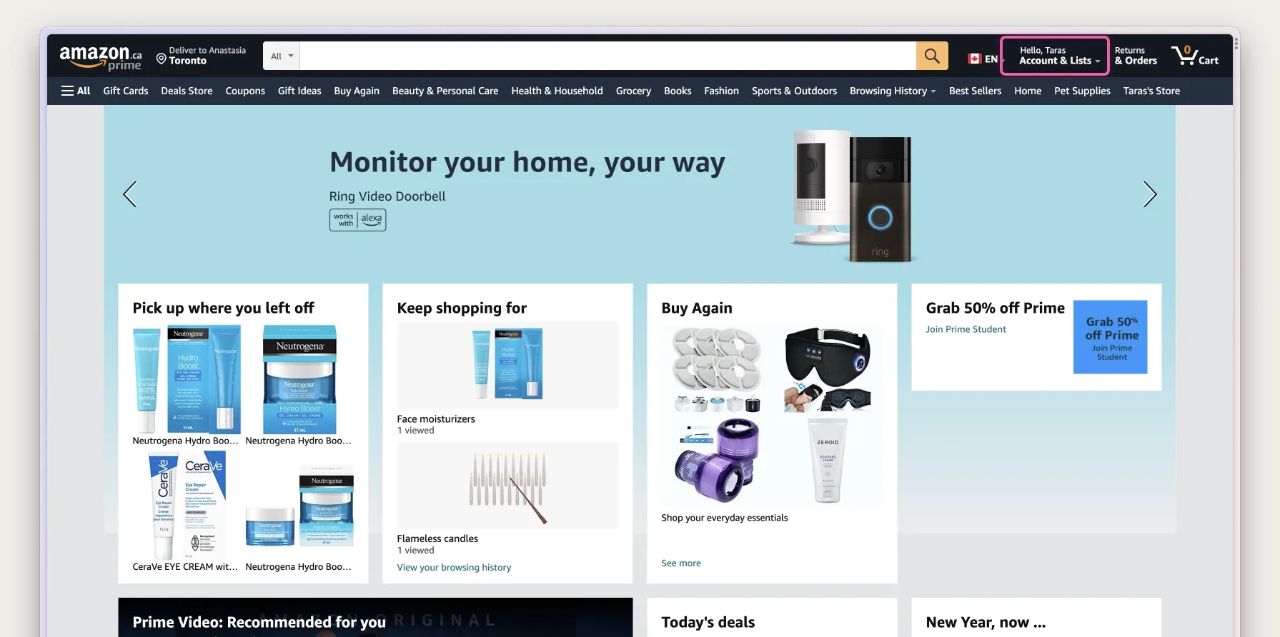
Upon landing on the account settings page, we can see various options available. The third option, "Prime," is the one we are looking for. This option allows us to manage our subscription, as stated in the description.
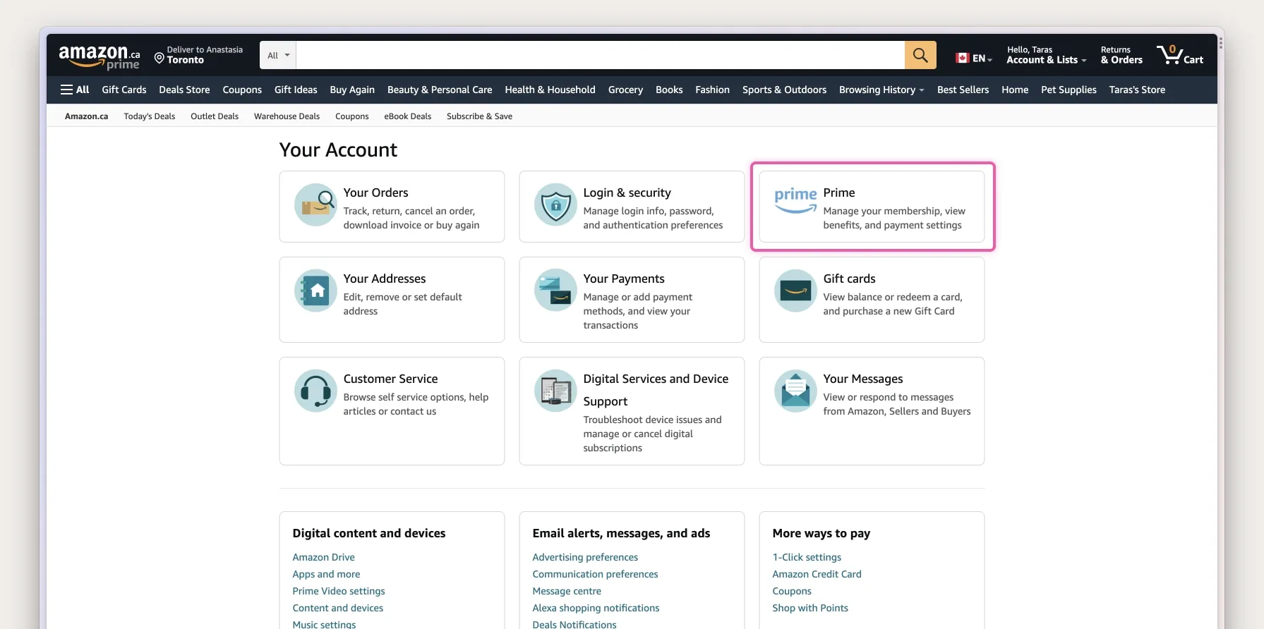
Now, we are on the Prime subscription page. At first glance, this page only highlights the benefits of having a Prime membership.
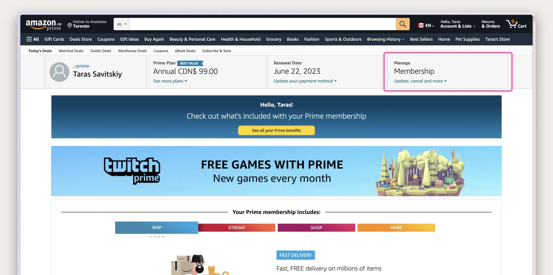
Despite being a current subscriber, the page presents three sections with colourful graphics that heavily promote the membership's benefits. This raises the question of whether Amazon suspects the user may want to cancel their subscription. One of the first dark patterns that can be observed here is Misdirection. The colourful tabs and the yellow call-to-action button only provide information on why one should keep the subscription.
The button we need to cancel the subscription is blended into the page and difficult to spot. We have to scan the page again to find the link. It appears we have to go one level deeper to reach the page where we can manage our membership. The button with the title "Update, cancel and more" seems to be exactly what we need.
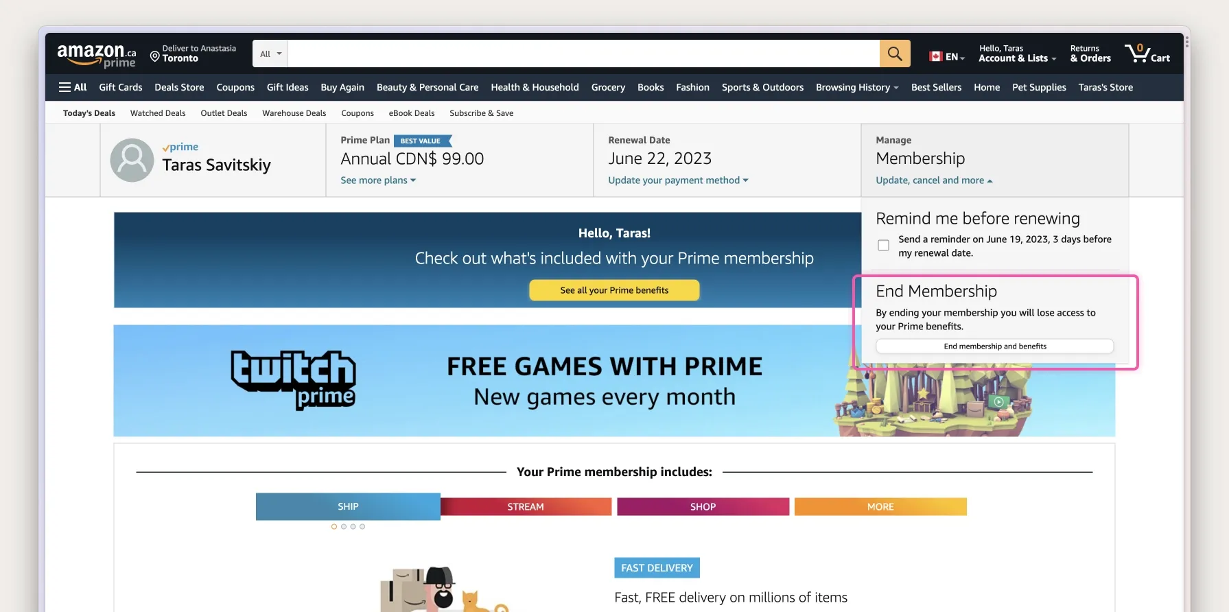
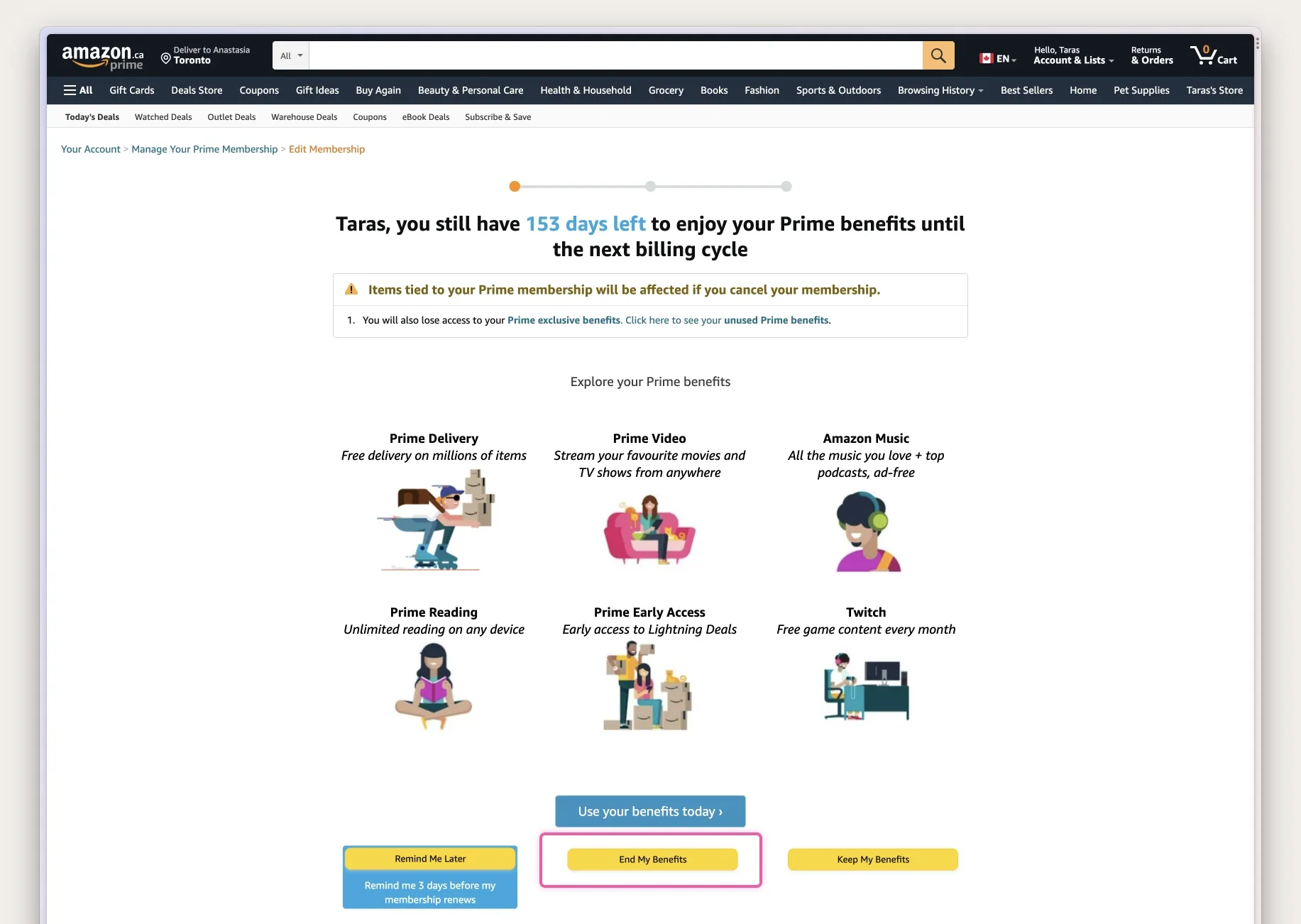
Upon clicking on the "Membership" block, a menu item appears with two options. The first option allows you to "Send a reminder before the renewal date." The second section includes the "End membership and benefits" button. It's worth noting that the "End membership and benefits" button is presented as a secondary button with a neutral colour.
Unfortunately, the journey to cancel a Prime subscription is not over yet. This example can be even more complicated than the process of cancelling a Dropbox subscription, involving a five-step process. The next page presents yet another attempt to convince the user to keep their membership by highlighting the benefits of Amazon Prime.
The page is designed to make the cancellation process complex and confusing through attention manipulation techniques in the user interface to steer the user towards keeping their membership instead of cancelling it.
After we finally locate the "End My Benefits" button that is placed in between two other primary buttons, we can move on to the next step of the cancellation process.
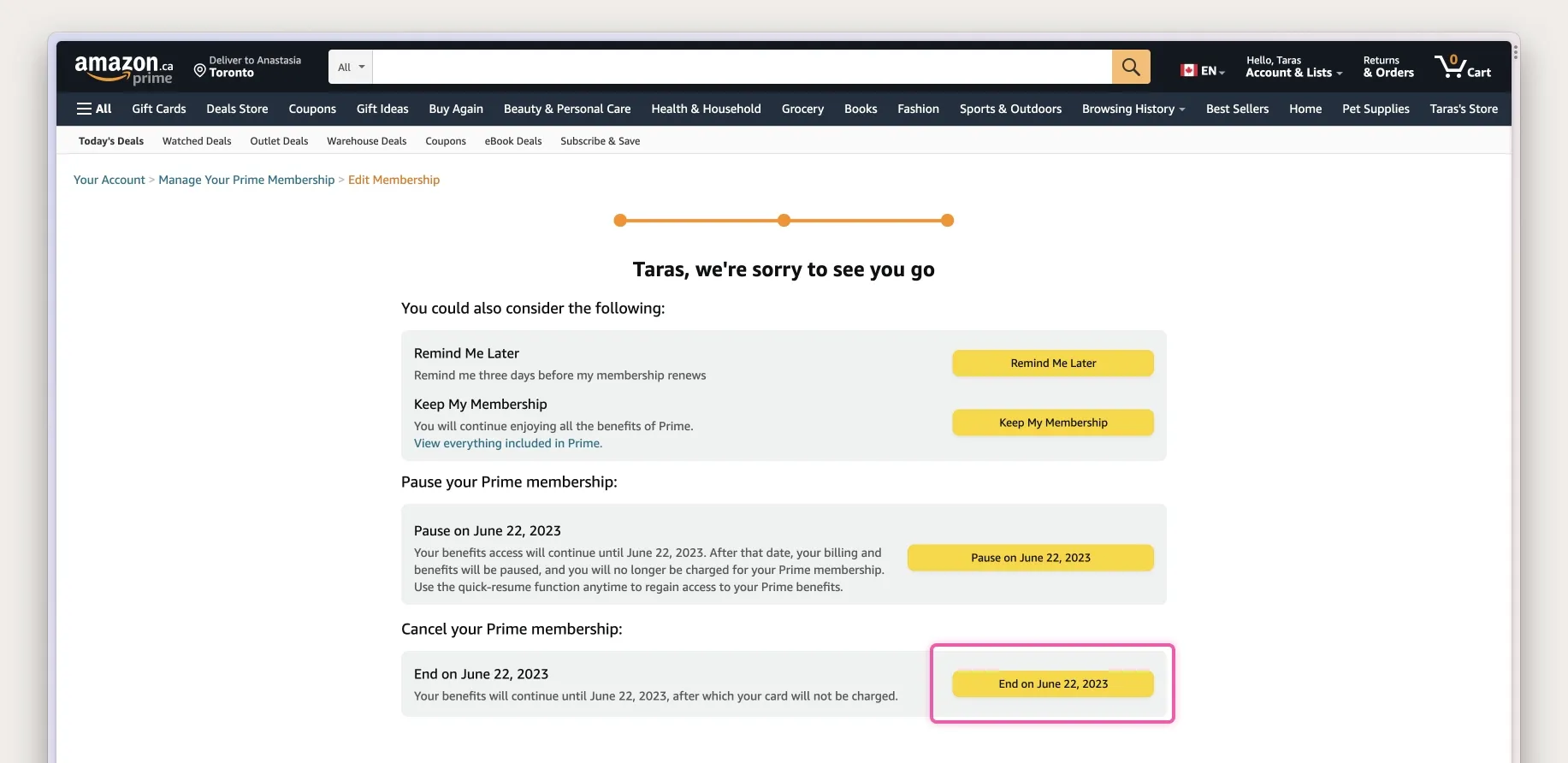
Do you think we are done yet? Another page tries to convince us to stay with Amazon Prime by switching to monthly payments. Also, we just noticed the stepper components at the top of the page that indicate two more steps ahead of us.

Finally, we have arrived at the last page, hoping it will allow us to cancel our Prime membership with Amazon. Even on this final page, Amazon creates as many obstacles as possible to prevent users from cancelling their subscriptions. The page presents four primary buttons, with the cancellation button placed explicitly as the last option, requiring users to scroll on smaller displays or mobile devices.
Throughout the whole process, we encounter several examples of dark patterns, such as Misdirection, where the user interface is designed to manipulate the user's attention and steer them towards keeping their membership instead of cancelling it.
We also encounter obstacles, such as pages that attempt to convince the user to switch to monthly payments instead of providing clear cancellation options. Amazon creates as many obstacles as possible to prevent users from cancelling their subscriptions, making it a total of SEVEN clicks to cancel a subscription.

